


The Origins of the Boldstance Emblem
At its core, Boldstance is more than a brand — it's a movement.
And like all great movements, ours began with a single step — one that would evolve into our defining symbol: The Stride .
From Vision to Visual Identity
In 2016, as Boldstance was taking shape, we knew we needed an emblem that could speak not only for the brand but also for the people who embody its spirit.
We partnered with Berlin-based designer Jonas Söders , whose work blends minimalism with motion, to create something timeless yet dynamic.
His brief was simple in theory, but bold in intent:
"Design a mark that captures forward motion, clarity, and strength — not just for today, but for years to come."
The Science Behind the Shape
Jonas drew inspiration from two key sources:
Biomechanics of movement – how athletes push forward, shift weight, and build momentum.
Geometric precision – symmetry, balance, and clean lines that reflect intention and control.
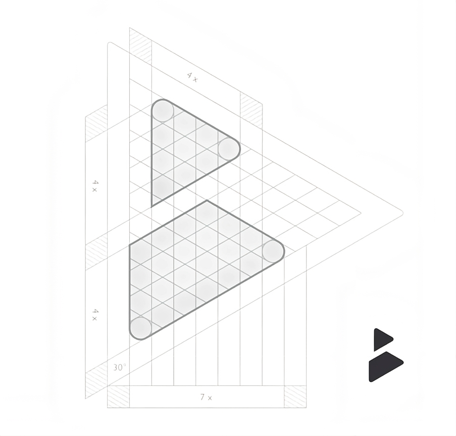
From this foundation emerged The Stride : a sharp, angular form suggesting motion, grounded by a strong base that speaks of stability and conviction.
Each element was crafted with meaning:
Triangular structure reflects upward progression and forward drive.
Negative space subtly evokes transition — the idea of always moving ahead.
Symmetry and line weight convey clarity, focus, and discipline.
Why It Matters
An emblem isn’t just a logo — it’s a visual declaration of purpose.
With every iteration and refinement, Jonas and our team ensured that The Stride wasn’t just aesthetically striking, but emotionally resonant. It had to feel like action. Like progress. Like Boldstance.
Today, it stands not only as our brand icon, but as a reminder of what we believe in:
"Rise Boldly. Stand Firmly. Move Forward."
Want to explore the deeper symbolism behind The Stride?
Discover the meaning →